
Simulation Graphs Tab
After the current model is simulated, the following nodes in the Tree View will have a Simulation Graphs tab:
- The
 Reservoirs and Wells root node
 - Each
 Reservoir Node
 - Each

 Well Node (dry holes and appraisal y exploration wells only have expenditure graphs)
 - The
.png) Facilities node in the Surface Layout
Facilities node in the Surface Layout - Each

.png)
.png)
.png) Facility Node
Facility Node - Each
 Well Groups node
That is to say, simulation graphs are always associated to individual objects or to generic groups of objects. They show the evolution of production results or cash flows for these specific objects.
All simulation graphs consist of the following parts:
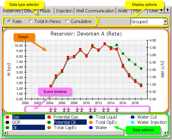
Click image to expand or minimize.
- Data type selector: Present data as Rate, Total in Period or Cumulative values. If a less-than-yearly report periodicity is selected, the Yearly Cum option is added to display aggregated annual values. Note that the Cumulative option only works for variables for which displaying cumulative values is meaningful; in cases where it is not (such as Water Cut or potential rates) the option is overridden and rates are displayed instead.
- Display options: Depending of the node selected in the Tree View, use these dropdown boxes to select:
- Fluid type or expenditure (only for Reservoirs & Wells node and Facilities node, and for Reservoirs nodes when the Well by well option is selected in the second dropdown box).
- Aggregation level: Select whether the graph curves refer to individual or aggregated objects. For reservoirs, wells and well groups the options are: Group by group: curves represent reservoirs or groups contained in the selected user group; Grouped: curves represent aggregated values (per fluid or cost) for the selected reservoir or group; Well by well: separate well production for the selected reservoir or groups.
In the Facilities node the options to filter results per facility are: All Facilities, only Injection Facilities, With production wells connected, With no wells connected, or Custody Transfer Facilities (= sales points, end of production line). - Graph: Main representation of the results according from the selected options. Here the data selected in the data selector below are presented on a timeline (x-axis) and their specific unit type on the y-axis. See Graph operation options below.
- Event timeline: Icons representing simulation events related to the selected node, arranged on the timeline (x axis).
- Data selector: Select the items to display on the graph, depending of the type of node selected in the Tree View and the display options. For example, if you have selected the Reservoirs and Wells node, you will see here only the reservoirs defined in the project. If you select a single reservoir node instead and Grouped in the display options, you will see the list of possible fluids, expenditures and number of producers & injectors online, but if the display options are set to Well by Well you will see the list of wells in that reservoir instead.
Normally, two or more curves can be represented on the same line chart only if they share the same Units and scale. PetroVR supports representation of up to two different unit types on the same chart, with each scale given on each side (i.e., with two y-axes independent from each other). Therefore, PetroVR will not allow you to select items in the data selector which are presented in more than two unit types. For example, in the above graph, Oil and Potential Oil correspond to the left axis where Liquid Volume is used (M bdp), whereas Gas is plotted according to the right axis (Gas Volume unit type = MM scfd). If you add another Liquid Volume curve like Water the axes will not change; but if you add one which uses a different unit type (e.g., Total OpEx, which is defined as Money per Time), the new unit type will replace Gas Volume in the right axis, and all Gas Volume items will be automatically deselected.
The unit initially used on the vertical axes is the default unit (set in the Preferences Tab) for the unit type corresponding to the curve.
In the Group by group display option, when two groups or reservoirs included in the same user group have one or more wells in common, PetroVR does not allow selecting both simultaneously, to avoid representing the same data twice in one graph. Items that cannot be selected will be grayed out.
The x-axis of the graph always represents the timeline, divided into the number of periods defined in the Report Periodicity and Simulation Span pane of the Preferences Tab.
How PetroVR Graphs Display Rates
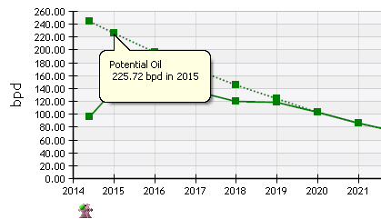
When the Data type selector is set to Rate and the Toggle Stacking option has not been enabled, each curve point indicates the average production or cash flow of the reporting period starting at that point. That is to say, each point does not represent the rate at that point of time (the first day of the period), but the average between that day and the end of the period. Thus, in the example below the Potential Oil rate of 225.72 bpd is not the rate at the beginning of 2015 but the average rate for the whole of that year.
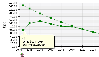
The first point of the curve works differently: it is located not at the beginning of the period but at the exact point the rate starts being calculated, and indicates the average rate not of the whole period but of the segment between that point and the end of the period. For wells, this means the day they come online. For reservoirs and groups, it means the first day that their first well comes online. For facilities, it marks the day the facility enters its production line, not the day it actually starts processing fluids. This means that if there is a lag between the moment it goes online and the time if first receives fluids, that idle period will be computed in the average.
In the example below of a well production graph, the Oil rate of 95.63 bpd is the average production between 05/25/2014 and 12/31/2014.
If a well or facility is abandoned, the rate for the last period is represented in a similar fashion: the chart shows the average production or cash flow of that well/facility during the days it was still active and not for the whole reporting period (though the point is not actually placed on the last day in the graph).
The special treatment of the first and last activity periods does not apply if Toggle Stacking is enabled. In this case, the average for the whole of both periods is used. The reason is that stacked graphs are naturally conceived for representing the combined information of several assets, which do no necessarily share the same starting/finishing date.
Graph Operation Options
You can click on any point of the curve to obtain more information: name of the curve, and exact value and period.
In the case of curves representing fluid rates, the style of the curve indicates the type of data: potential rates are represented with  dotted lines, and actual rates with
  solid lines. In stack graphs (see below), potential rates are
  hatch, and actual rates
  solid.
The following options and commands are available by right-clicking on the graph area:
- Select Left / Right Unit: Choose the specific unit to be used in the y-axes. (Click on the left or the right half of the graph to select each.)
 Copy plot data to Clipboard: Copy all plot data as a table (or tab-separated plain text).
  Copy to clipboard: Copy chart to the OS clipboard in two formats: as a Windows metafile (vector format file) and as a bitmap.
  Export to Excel: Export the current graph to a MS Excel spreadsheet as an editable Chart object type, with all the chart data and captions presented in tabular form. The digital Model Signatures of the project are also included in the graph. The graph will be exported to an already opened spreadsheet (the last visited if there is more than one), or to a new spreadsheet if Excel is currently closed.
 Zoom: Zoom in the graph horizontally.
 - Zoom normal: Zoom the graph to fit the current window size. You can also use the mouse wheel while pressing CTRL to switch between these two.
- Toggle Bar Style: Switch between lines connecting average rate points and horizontal lines representing period averages.
- Toggle Stacking: Instead of showing separately the curve of each element that has been selected in the Data selector at the bottom, stack those curves that share a unit type in order to view both the separate contribution of each element and the total. Note that this option stacks all the compatible curves shown in the graph - that is, those that use the same scale on the Y axis. To limit the stack to a set of curves, send the graph to a User-Defined Graphs to use the options available there.
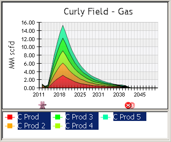
The order in which the functions are stacked is determined by the order in which they are selected: the first item selected will be at the bottom of the stack.
The production curves of two facilities one of which is downstream from the other cannot be stacked, since the produced fluid is the same.
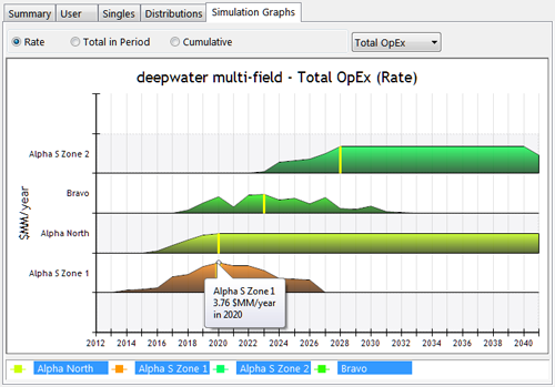
- Toggle Summary: Only available in graphs that contain information on several objects of the same type: Reservoirs & Wells (reservoirs), Reservoir (wells - only when the Well by well display option is selected), Facilities, and Well Group nodes. Use this option to display each object in a separate row. A vertical yellow line indicates the moment the highest peak in the production is reached.
The icons below the graph represent events that occurred at that particular time of the simulation. Click on one to see the full details about the event (type, date, objects involved, etc.)
 Abandoned (facilities, wells, connections & pipelines) or aborted (drilling or completion job, intervention)
 Well goes online (for the first time or after a choke), or facility enters the production line
 Well or facility production rerouting
 Gas Lift or ESP installed
 Gas Lift or ESP activated
 Well drilled
 Completion performed
 Drilling or completion started
 Well intervention or facility construction started
 Well choked
 Well drilling or completion deferred
 Facility expanded
- Facility construction job completed
 shut in (indicating the facility at which the excess occurred)
 Compression installed
 Well decline manipulation performed